
Yeah, I know. I’ve been radio silent for a while. Sorry. Turns out I learned that I’m not a HGTV-lifestyle type blogger. I know their ilk since I’ve been reading their blogs–their posts on trends and their how-tos written with folksy familiarity. The edgier ones smattering in some cuss words. The more wholesome peppering posts with sweet kiddos and doggos. The rarefied have chickens, which lay heirloom coloured eggs. Their kids have blonde ringlets festooned with sweet bows. They also serve up recipes. And dinner parties hosted at a clearing in their personal thousand acre woods lit with strings and strings of round bulbs powered by some mysterious source of 1% energy.
Nope. Writing about construction progress and current project status with accompanying pictures isn’t my forte. Not because I dislike that genre. I’ve definitely binge-watched many a remodeling series, hungrily following each episode to the great reveal. And, also, not because I don’t have scores of photos chronicling this journey.
I just can’t write it. Nope. This Doc does musing, angst, comedy and more thinking. Show and tell? Not without a point to make. And in the fast forward pace of this remodel, there hasn’t been much brain space left to make my points.
Sure there have been some decisions. And some real walls. And moments of beauty.
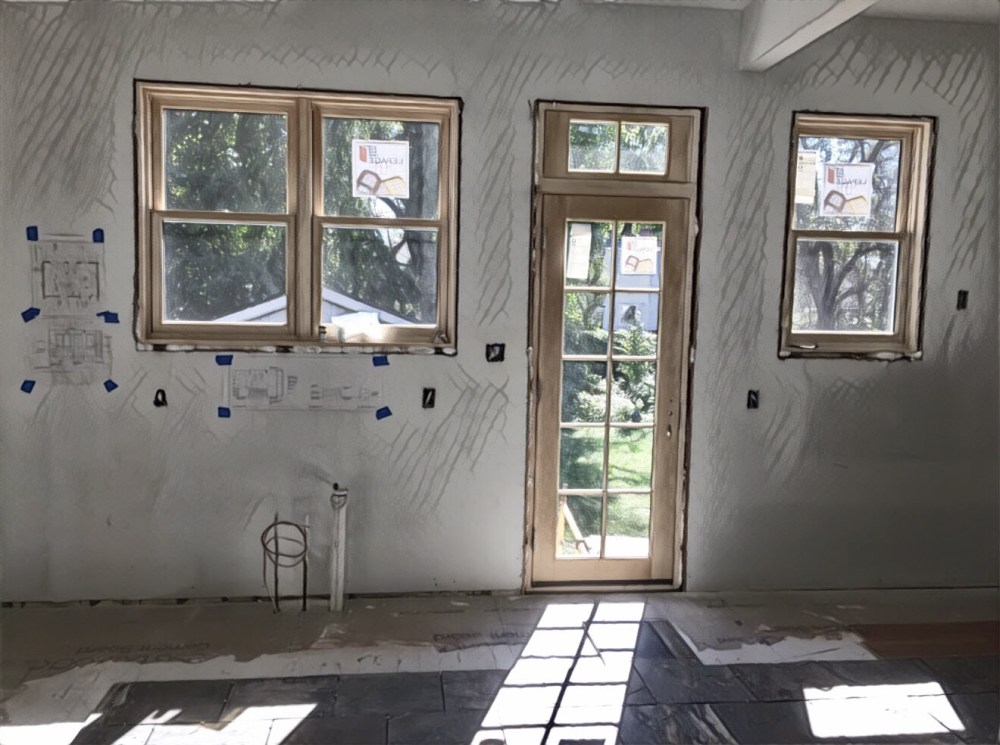
Like that moment when I walked upstairs to our bedroom and looked through the new window. Our bungalow is a classic story and a half, but when they rebuilt the walls and ceiling they recovered about eight inches of head room at the dormers. The construction team raised the windows up, too, and we have a new view to the outside and a more airy inside.
Taking in the new vista, I placed my fingertips on the newly drywalled and primed walls. I looked at my hand and recognized the perfectly familiar meeting of the knee wall angling to meet with the roofline. I suddenly ran through a series of memories–of painting that wall, of moving the bed (once moving the head to meet it, and once rotating it on the side), of steadying myself on it on groggy mornings.
Relief. My house is still here. I didn’t ruin it by stripping it down to its sticks. When I exposed its very bones. The house, its soul, still remains. I felt it in through the gypsum plaster that marked the newly finished corner. It told me it was okay.
Then there was the moment I needed to select cabinet hardware. It was more than a moment, to be honest. My wonderful design lead from the design-build team emailed me links two websites. She told me to pick out a few, and we’d order one of each to see what works.
There were literally THOUSANDS of choices. Overwhelming. So, I did what any modern Doc would do. I googled, “What to look for in kitchen cabinet hardware?”
Turns out that there are some things for the practical-minded to look for. First, there is a difference between knobs and pulls. Knobs are little and pulls are bigger. Bottom line, you don’t need to be as precise with your grab if you have pulls. Also, there are categories of pulls. There are bar pulls, handle pulls, finger pulls, cup pulls and arch pulls. Bar pulls can get caught on wayward pockets. Cup pulls can get full of the goop from your dirty hands that open the drawer to grab the extra whisk.
Armed with my new data, I downselected to handle pulls that were black or bronze and added those categorized by “industrial” or “rustic” style. And, still, there were hundreds. I started scrolling the options.
The first one I liked was $20. For one cabinet pull! Some long drawers could require two. I could easily spend thousands of dollars in kitchen hardware. I immediately added a downselect with an upper dollar limit to accommodate my budget. There were still a bunch.
My search and selection process could have consumed hours. I stopped looking after I found four that I could like. I slapped myself. Really, Doc? What’s a “good” cabinet pull? For items that, to be honest, I can’t tell apart? I cut and paste links to pulls, hit send and haven’t looked back. Don’t ask me what I chose. I don’t even know if my selections come in the right size. I’m praying that the pro makes sense of my design idiocy.
Then there’s that color moment. Last time I painted was the unfinished refresh of our bedroom. I know exactly the day I stopped painting. September 11, 2001. Just never got back around to it. I lost interest in color around the time I lost interest in the project.
Now I have to choose colors for all the rooms in the house. Someone said to paint it all white or taupe or greige or some neutral. But I have pro-painters using fabulous paint at my disposal. And I’m not moving the furniture to paint again. This is my moment.
I don’t want my house to have that flipped house gray with white trim. Or that creamy builder white. No. No. No. I walk into the open houses for the new crappy condos popping up all over my neighborhood and feel nothing but coldness. I check out the newly rehabbed homes with their cookie cutter granite countertops and cheesy cabinets and their achromatic walls and feel empty.
Ours is a 1915 bungalow that traditionally had that craftsman/arts and craft palette with muted vegetable colors of squash and pumpkin and greens tinged with yellow. Colors with names like ochre and olive, walls to be framed in natural wood.
I imagined walking in the front door with the brown stained wainscoted walls topped by that yellow squash color, turning to the muted yellow green in the living room and stepping into a pumpkin dining room. I started pulling paint chips for this warm, autumnal color scheme. I found historical palettes online and assigned colors to rooms. We’d paint a few samples on the walls before making a final call.
One problem. I don’t actually like those colors. Sure, they were better than the colorless “new house” look I was railing against, but they actually brought me down and closed me in. I wanted colors that had warmth but a cool vitality. Back to the google drawing board.
I decided to back up. What colors make me happy? What colors did I want to be surrounded by? What colors looked good together and flowed from room to room, too? I flipped through Design Seeds, focusing on how the images made me feel. I dismissed photos, not looking at palettes. I pinned the pics I liked. I saw that my aesthetic had a clear pattern. Now I have a bunch of paints to try on the walls. My starting point is authentic.
So, sure. There’s been stuff rolling around in my brain, some causing strain and some stirring emotion, but none with much of a tale.
Yesterday, I took my regular foray to the worksite that will soon, once again, be my home. And my excitement was definitely tempered. After weeks of daily transmogrifications–of sticks being formed into walls that became rooms and closets and hallways and entries, of a huge rectangular box that time-lapsed into a kitchen lined with cabinets centered with an island and framed by a light wall, of the hole between the upstairs and the basement bibbidi-bobbidi-boo’d into a grand staircase–things have slowed down. I’ve entered
The trough of disappointment.
This is the part of the hype-cycle. The part following the peak of unrealistic expectations. Stuff is happening, but we’re waiting on the delivery of the grout, and there is some challenges with the cabinet install, the basement windows had to be reordered and there will be some painstaking craftsmanship that will go into the creation of beautiful trim (no prefabbed trim for this project).
Meanwhile, I’m studying the project calendar every day. Sometimes more than once a day. Okay. Always more than once each day. As if by looking at the schedule it will move ahead. I walk into the house daily, on my way home from work. The actual days have shortened to leave me only a few moments of light before it switches over to night. Next week there won’t be any daylight moments on my way home.
This is the time where you can see the finish line, but there is still a grueling distance ahead. This is the time when I want to be on the other side of that line.
I want to move home and figure out where to put my colanders and to hang my winter coats in the closet. I want to unpack my waffle maker that I stored in the basement. I want to line up my spices in the new kitchen and put the good dishes on the dining room table. I want this computer to be on my new wooden desk in the office. I want to place my shampoo on the bench in the upstairs bathroom and put my hair dryer in the new closet.
I’m really done with this project. These last few yards need to be ground out, but the excitement has faded. This week anyway. I’m ready to move in and move on. I know there are more finishes and more surprises that will get me back in the game. But now, today? I’m wishing that I could buy a fifth of brown patience liquor.
I hate waiting.


